Designing a logo patch starts with preparing the right artwork file and choosing a patch type that matches your design’s complexity. Get either of those wrong, and your finished patch won’t look anything like what you imagined.
I’ve reviewed hundreds of patch artwork submissions — and the same mistakes appear over and over. Too much detail. Wrong file format. Gradients that can’t be stitched. This guide walks you through the entire process, from your first sketch to a production-ready file, so you avoid those costly revisions before manufacturing even begins.
Whether you’re creating a custom embroidered patch for a brand, a jacket, or a club, this is the workflow that professionals actually use.
The way your logo is prepared can directly affect patch quality, readability, and stitching precision. Before finalizing your artwork, our Custom Patch Types Comparison Guide explains which patch styles work best for detailed logos, minimalist branding, and textured designs.
How to Design a Logo Patch: The Complete Artwork Process
Step 1 — Define Your Patch’s Purpose and Placement
Before you open any design software, get clear on where this patch will live and what it needs to communicate.
A hat patch design has very different constraints to a jacket back patch. A 2-inch chest badge needs bolder, simpler artwork than a 5-inch sleeve panel. Ask yourself:
- Where will the patch be worn or placed? (hat, jacket, bag, uniform)
- How far away will someone be when they read it? (close-up vs. across a room)
- What’s the primary element? (logo mark, wordmark, or combination)
This decision shapes everything downstream — your size, shape, stitch count, and level of detail.
Step 2 — Choose the Right Patch Type for Your Artwork Style
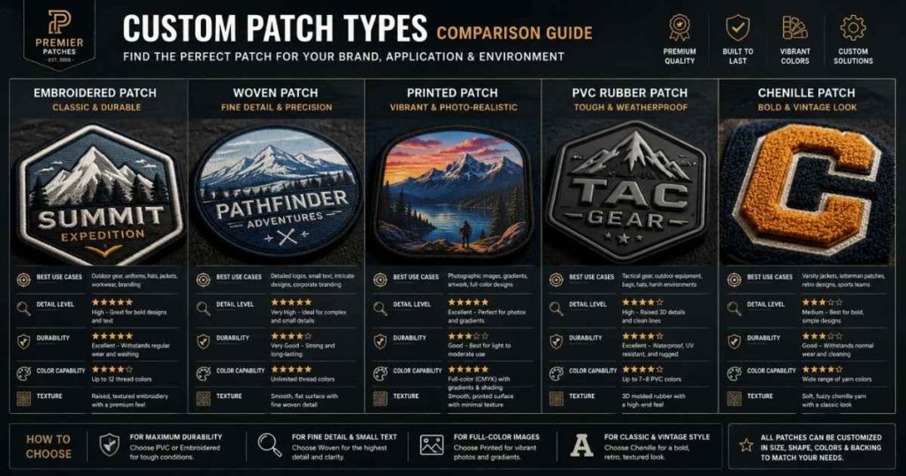
Not all patches are made the same way, and your logo’s visual style should determine which production method you choose. Picking the wrong type means your intricate artwork ends up unreadable, or your bold, simple logo ends up on a flat printed patch that lacks the premium feel you wanted.
Here’s a quick patch-type decision guide:
| Patch Type | Best For | Artwork Style |
|---|---|---|
| Embroidered | Logos, badges, uniforms | Bold, simple, high-contrast |
| Woven | Fine text, detailed graphics | Intricate, small-scale artwork |
| Printed | Photos, gradients, full-colour | Complex imagery, unlimited colours |
| PVC | Outdoor, weatherproof use | Bold, 3D-friendly shapes |
| Chenille | Varsity, retro lettering | Simple, large-scale shapes |
In my testing with manufacturers like Patches4Less and THE/STUDIO, embroidered patches on a twill fabric base consistently deliver the most premium result for brand logos — but only when the artwork has been properly simplified first.
Step 3 — Create or Adapt Your Logo Artwork
If you already have a brand logo, you’re starting in a good place — but you’ll almost certainly need to adapt it for patch production.
Starting from scratch? Use vector-based software:
- Adobe Illustrator — the industry standard for professional vector artwork
- CorelDRAW — a strong alternative, popular with embroidery shops
- Inkscape — free, open-source, and more than capable for most patch designs
If you’re exploring concepts quickly, tools like Canva or AI image generators such as Adobe Firefly and Midjourney can accelerate the early ideation phase. However, AI output always needs to be rebuilt as clean vector artwork before it goes to production — more on that in a dedicated section below.
Adapting an existing logo?
Open your logo in Illustrator or Inkscape and assess it against these three questions:
- Does it use gradients or drop shadows? (These don’t translate to thread)
- Is any text smaller than ¼ inch at the intended patch size? (It’ll become unreadable)
- Does it have more than 7–9 distinct colours? (You’ll pay extra for each one above the base limit)
If the answer to any of those is yes, logo simplification is your next job.
If you are creating patches specifically for workwear, proper artwork simplification becomes even more important for durability and consistency. Custom Patches for Employee Uniforms covers practical considerations for logos used on employee apparel and industrial uniforms.
Step 4 — Simplify Your Design for Embroidery or Print Production
This is the step most people skip — and it’s the one that causes the most re-work.
Embroidery machines stitch thread, not pixels. They can’t replicate fine hairlines, soft gradients, or photo-level detail. When you simplify your artwork for a twill patch, you’re not dumbing it down — you’re translating it into a medium that has its own visual language.
Key simplification rules:
- Remove all gradients. Convert them to solid blocks of colour or use hatching stitches (your digitizer can help with this)
- Thicken thin lines. Any stroke thinner than 1.5mm at final patch size will likely disappear in stitching
- Reduce your colour count. Most manufacturers include 7–9 patch thread colours in the base price; going beyond that adds cost per colour
- Increase text size. Letters need to be at least ¼ inch (roughly 6mm) tall to remain legible as embroidery
- Simplify small details. Complex elements that are smaller than 5mm will be lost — either enlarge them or remove them
For woven patches or printed patches, you have more latitude with detail. But the simplification principle still applies: the cleaner and bolder your artwork, the crisper the finished patch.
Step 5 — Choose Your Patch Shape, Size, and Border Style
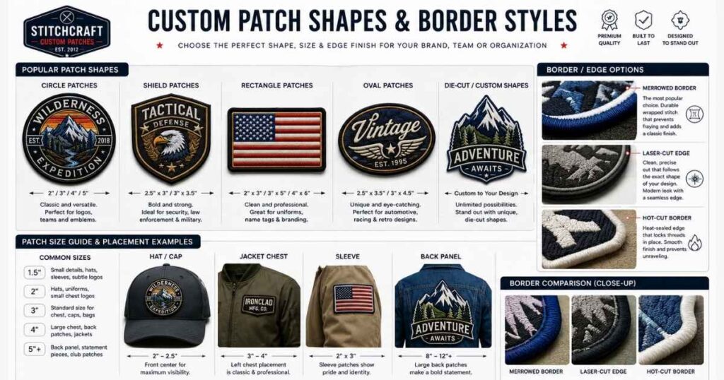
Shape and size affect both the aesthetics and the pricing of your patch. Most manufacturers calculate cost based on the average size (length + width ÷ 2), so an irregular shape could cost the same as a rectangle of similar dimensions.
Common patch shapes:
- Circle / oval — great for logos with a round badge feel
- Rectangle / square — clean, versatile, works for most brand marks
- Shield — popular for security, sports, and heritage brands
- Die-cut / custom shape — cut to the silhouette of your artwork; adds premium appeal
Border styles to consider:
- Merrowed border — the classic overlocked edge; adds a raised, polished frame; standard on most embroidered patches
- Laser-cut / hot-cut border — trimmed close to the design edge; suits irregular or custom shapes
- Iron-on backing — not a border style, but an important backing choice; heat-activated adhesive for easy application without sewing
When I reviewed artwork submissions at Sienna Pacific, the most common sizing mistake was designers forgetting to account for the merrowed border — it takes up 2–3mm around the edge, which can clip fine detail on the outer rim of your design.
Step 6 — Finalise Your Colour Palette (Thread vs. Print Limits)
Colour works very differently in embroidery compared to digital or print design.
For embroidered and woven patches:
Thread colours are discrete — there are no blends, no CMYK, no hex codes. Colours are matched using the Pantone Matching System (PMS), which gives manufacturers a standardised reference point for thread selection.
- Most providers include 7–9 patch thread colours in the base price
- Some allow up to 12; beyond that, costs rise significantly
- Exact PMS matches aren’t always guaranteed in thread, but they’re a very close approximation
- Always confirm proposed thread colours on the digital proof before approving production
For printed patches:
You have far more freedom. Unlimited colours, gradients, even photographic imagery are all achievable. The trade-off is that printed patches can look less premium than embroidery on certain garments and may fade faster over time.
Practical tip: Limit your design to 6 colours or fewer for the cleanest, most cost-effective embroidered result. This forces you to make deliberate design decisions — and bold, simple palettes almost always look better on a patch than busy, multicoloured ones.
Step 7 — Prepare and Export Your Artwork File for Production
This is the most technically specific part of the process, and it’s where many designers stumble.
What manufacturers need:
| File Type | Use |
|---|---|
| AI / EPS / SVG | Vector artwork — ideal; scales without quality loss |
| PDF (vector-based) | Acceptable if exported correctly from Illustrator |
| PNG / JPG | Raster images; minimum 300 DPI at final patch size |
Vector files (AI, EPS, SVG) are always preferred. They can be scaled to any patch size without losing sharpness, and they make the raster to vector conversion step (if needed for digitizing) much faster.
Before you submit, run through this checklist:
- ✅ File is in vector format (or PNG at 300 DPI minimum)
- ✅ All fonts are converted to outlines / paths
- ✅ No gradients, drop shadows, or transparency effects
- ✅ Colours are specified in PMS references or CMYK
- ✅ Design includes a clear colour separation layer (one colour per layer)
- ✅ Minimum text height is ¼ inch at final patch size
- ✅ You’ve noted the intended patch dimensions in your brief
Startups and small brands often create sample patches before investing in bulk production. Our Custom Patches No Minimum Order — When It Makes Sense guide explains how small-run orders help test artwork quality and embroidery results before scaling.
Patch Types — Choosing the Right Style for Your Logo
Let’s dig a little deeper into each patch type so you can make a confident decision.
Embroidered Patches — Best for Bold, Classic Logos
Embroidered patches are made by stitching coloured thread onto a twill fabric base. The raised texture gives them a tactile, premium feel that’s instantly recognisable.
They’re the go-to choice for uniforms, motorcycle clubs, and heritage brand merchandise. The key limitation is detail: anything too intricate, too small, or too gradient-heavy will not translate well to thread. Think bold shapes, strong outlines, and high-contrast colours.
Embroidery coverage — how much of the patch base is covered by thread — is typically offered at 50%, 75%, or 100%. Full coverage gives the richest look; 50% coverage lets the twill show through, which works well for minimalist designs.
Woven Patches — Best for Intricate Details and Fine Text
Woven patches use much finer threads than embroidery, woven directly into the design rather than stitched on top. The result is a flat, smooth finish that can capture small text, fine lines, and intricate patterns that embroidery simply cannot.
If your logo includes small wordmarks, detailed line art, or elements below 5mm at patch size, a woven patch design is almost always the better choice. School and varsity uniforms frequently use them for exactly this reason.
Printed Patches — Best for Photorealistic or Gradient Artwork
Printed patches use digital printing to reproduce artwork with full-colour accuracy. They’re the only viable option for logos that rely on gradients, photographic elements, or more than 12 colours.
The trade-off: they can feel less “premium” than embroidery in certain contexts, and the printed surface may show wear over time. For merchandise, events, and promotional patches, they’re excellent value.
PVC Patches — Best for Outdoor, 3D, and Weatherproof Logos
PVC (polyvinyl chloride) patches are moulded from soft rubber-like material. They’re fully weatherproof, fade-resistant, and can be produced with 3D puff effects that embroidery can’t achieve at small scales.
They’re particularly popular for outdoor and tactical gear, bag branding, and anywhere the patch needs to survive harsh conditions. Your artwork needs to be bold and geometrically clean — fine detail gets lost in the moulding process.
Chenille Patches — Best for Varsity and Retro Lettering Styles
Chenille patches have a thick, yarn-based texture sewn onto a felt or fabric base. They’re strongly associated with varsity jackets, vintage aesthetics, and letter patches. They work best with simple, solid shapes and large letterforms — they’re not suited to complex logos with fine detail.
Artwork File Requirements: What Manufacturers Actually Need
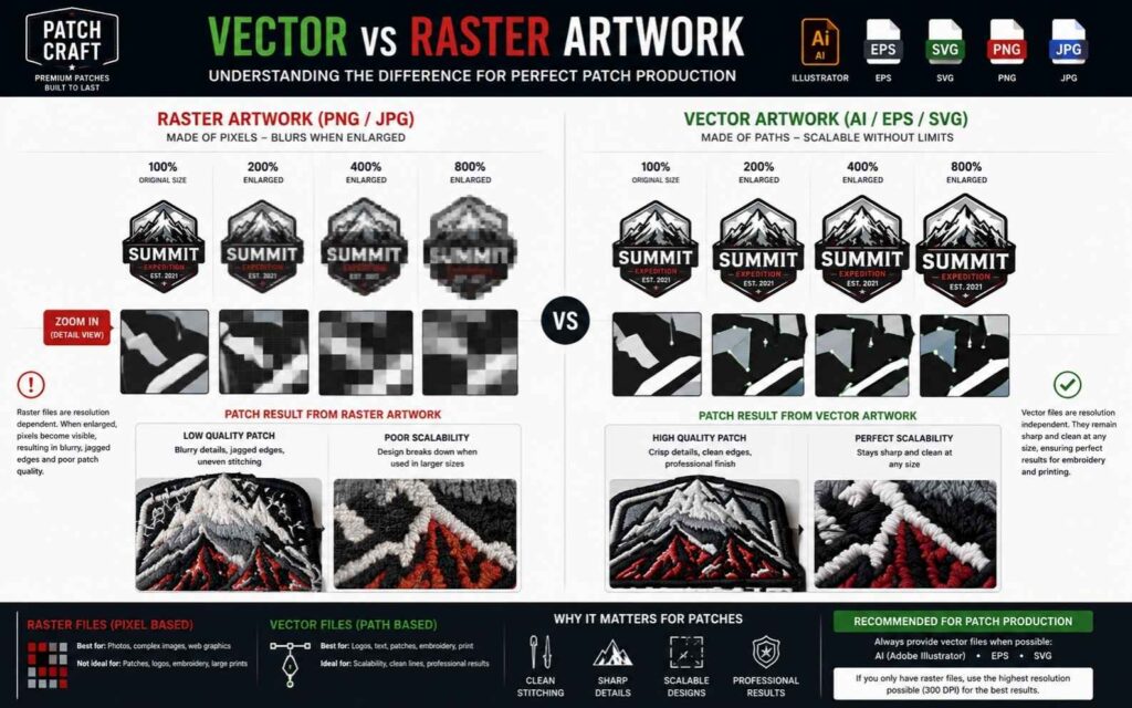
Vector vs. Raster: Why File Format Matters for Patches
A vector file (AI, EPS, SVG) stores artwork as mathematical paths and curves — so it can be scaled to any size without ever becoming pixelated. A raster file (JPG, PNG) stores artwork as a grid of pixels, which means enlarging it makes it blurry.
For patch production, this matters enormously. A 2-inch logo might need to be scaled up to a 6-inch jacket back patch. If you started with a raster file, the quality degrades. If you started with a vector file, it stays sharp at any size.
Always request or create your artwork in vector format from the start. If you only have a raster logo, use Illustrator’s Image Trace or Inkscape’s auto-trace function, then manually clean up the result before submitting.
Colour Mode: Pantone (PMS), CMYK, or Thread Colour Matching
When working with embroidery suppliers, specify your colours in Pantone PMS references wherever possible. This is the universal language of professional colour matching, and it’s how thread manufacturers catalogue their colour ranges.
If you’re designing in Adobe Illustrator, you can add Pantone colour swatches directly from the Swatch Libraries. This removes the guesswork and ensures the manufacturer selects the closest possible thread match.
Digitizing Your Logo for Embroidery Patches (Explained Simply)
What Is Embroidery Digitizing and Why Does It Matter?
Embroidery digitizing is the process of converting your logo artwork into a stitch file that an embroidery machine can read. It tells the machine exactly where to place each stitch, in what direction, at what density, and in what colour sequence.
Without digitizing, an embroidery machine is just a sewing machine with no instructions. A poorly digitized file leads to thread breaks, gaps in coverage, misaligned elements, and a patch that looks nothing like your logo.
The output of digitizing is a machine file — typically a DST file or PES file depending on the machine brand. These are the files manufacturers actually use for production.
DIY Digitizing Tools: Ink/Stitch, Brother PE-Design, Wilcom
If you want to digitize your own designs, here are the main tools:
- Ink/Stitch — a free, open-source plugin for Inkscape. Steep learning curve but surprisingly powerful for basic to intermediate designs
- Brother PE-Design — beginner-friendly, good for home embroiderers and small batches
- Wilcom Embroidery Studio — the professional standard used by commercial embroidery shops worldwide; starts around $3,500 and requires significant training
For most people designing a patch for production (rather than sewing it themselves), digitizing is outsourced to the manufacturer or a specialist service.
When to Outsource Digitizing (and How Much It Costs)
Unless you’re running a commercial embroidery operation, outsourcing digitizing almost always makes sense. Professional digitizing typically costs between $10 and $150 per design, depending on complexity.
Many patch manufacturers — including Patches4Less, THE/STUDIO, and World Emblem — include free digitizing when you place a production order. Services like Printify also handle the digitizing step automatically when you submit a logo for embroidery products.
If you’re outsourcing, always request the editable master file (EMB or OFM format) alongside the machine file. This means future edits and rescales don’t require paying for re-digitizing from scratch.
Stitch Types: Satin, Fill, and Running Stitches Explained
Your digitizer will choose from three core stitch types to build your patch artwork:
- Satin stitch — parallel stitches that run back and forth across a shape; ideal for text, borders, and thin elements; creates a smooth, shiny surface
- Fill stitch — rows of stitches used to cover large areas; the direction of rows creates subtle texture; the workhorse of flat patch surfaces
- Running stitch — a single line of stitching; used for fine outlines, detail work, and underlay stitching beneath heavier layers
Understanding these helps when you’re communicating with a digitizer about how you want your logo to look — especially for elements like shadows, textures, or dimensional effects.
Using AI Tools to Design a Logo Patch (2025 Methods)
AI has genuinely changed what’s possible in the early stages of patch design — but it hasn’t replaced the need for clean vector artwork.
Best AI Design Tools for Patch Artwork
- Adobe Firefly — integrated into Illustrator; generates vector-friendly artwork you can directly refine
- Midjourney — excellent for generating patch-style concept art; produces stunning retro badge and emblem aesthetics
- ChatGPT (with image generation) — useful for quick visualisations and prompt-driven badge concepts
How to Write Effective Prompts for Patch-Style Artwork
Specificity is everything. A vague prompt produces a vague result. Here’s a framework that works:
“Design a [shape] patch in [style] style for [brand/club name]. Include [key elements]. Use [colour palette]. The design should have a clear border and be suitable for embroidery with bold, solid shapes.”
For example: “Design a circular patch in vintage national park style. Include a mountain silhouette, pine trees, and the words ‘Summit Ridge Est. 1989’. Use navy, cream, and forest green. Bold, embroidery-friendly artwork.”
Refining AI Output in Adobe Illustrator or Inkscape
Once you have a strong AI concept, the workflow is:
- Export the generated image as a high-resolution PNG
- Import into Adobe Illustrator and use Image Trace to convert to vector paths
- Manually clean anchor points, smooth curves, and remove unnecessary detail
- Separate into colour layers and assign PMS colour references
- Export as AI or EPS for submission
This hybrid approach — AI for concept, vector software for production — is the most efficient patch design workflow in 2025.
Well-designed logo patches can also become premium branding assets for ecommerce stores and creator merchandise. Learn how online brands use custom logo patches effectively in Custom Patches for Branded Merchandise and Merch Stores.
Common Logo Patch Design Mistakes (and How to Avoid Them)
Too Much Detail for the Patch Size
A design that looks great at A4 on screen often falls apart at 3 inches on a jacket. Always proof your design at 1:1 scale before submitting. Print it out, cut it to size, and hold it where the patch will sit.
Using Gradients in Embroidery Designs
Thread is a solid medium. There is no such thing as a gradient in embroidery — it has to be simulated using directional stitching, and even then, the effect is subtle. If your brand logo relies on gradient fills, either choose a printed patch type or redesign the artwork with solid colour blocks.
Text Too Small to Read at Scale
Embroidery has a physical minimum text size: ¼ inch (6mm) tall for legible letterforms. Below that, letters begin to merge and blur together. If your patch has small sub-text — a tagline, a location, a founding year — either enlarge it, remove it, or switch to a woven patch that can handle finer detail.
Supplying Low-Resolution Raster Files
A 72 DPI PNG from a website looks fine on screen but is essentially unusable for patch production. If you don’t have the original vector file, you have two options: use raster to vector conversion software (with manual cleanup), or ask your original designer for the source file. Never submit a low-resolution image and hope for the best.
Frequently Asked Questions
What file format do I need to design a patch?
Can I design a patch in Canva?
How do I convert my logo to an embroidery file?
How much does it cost to digitize a logo for a patch?
What size should a logo patch be?
Can you use a logo with gradients on an embroidered patch?
What is a merrowed border on a patch?
Summary: Designing a Logo Patch That Actually Gets Made Right
Learning how to design a logo patch is about more than making something look good on screen — it’s about understanding the constraints of the production method and designing within them from the start.
To recap the key principles:
- Choose your patch type first — it determines how you design the artwork
- Use vector software from day one (Adobe Illustrator, Inkscape, or CorelDRAW)
- Simplify your logo — remove gradients, reduce colours, increase minimum text size
- Specify Pantone PMS colours so thread matching is accurate
- Understand digitizing — whether you do it yourself or outsource it, it’s the critical bridge between your artwork and the finished patch
- Submit the right file — AI, EPS, or SVG preferred; PNG at 300 DPI minimum
The difference between a patch that looks like your brand and one that doesn’t almost always comes down to artwork preparation. Get that right, and the manufacturing process becomes straightforward.
Whether you’re designing a simple iron-on patch for merchandise or a full jacket patch artwork for a brand launch, the process is the same. Start clean, stay bold, and design for the medium — not just for the screen.
Have a logo that needs adapting for patch production? Drop the file format and patch type you’re working with in the comments — happy to point you in the right direction.
Pingback: Custom Patches for Employee Uniforms: The Complete Guide - Apex Patches
Pingback: PVC Patches for Tactical Gear: Guide to Choosing, Attaching, & Customizing Your Kit - Apex Patches