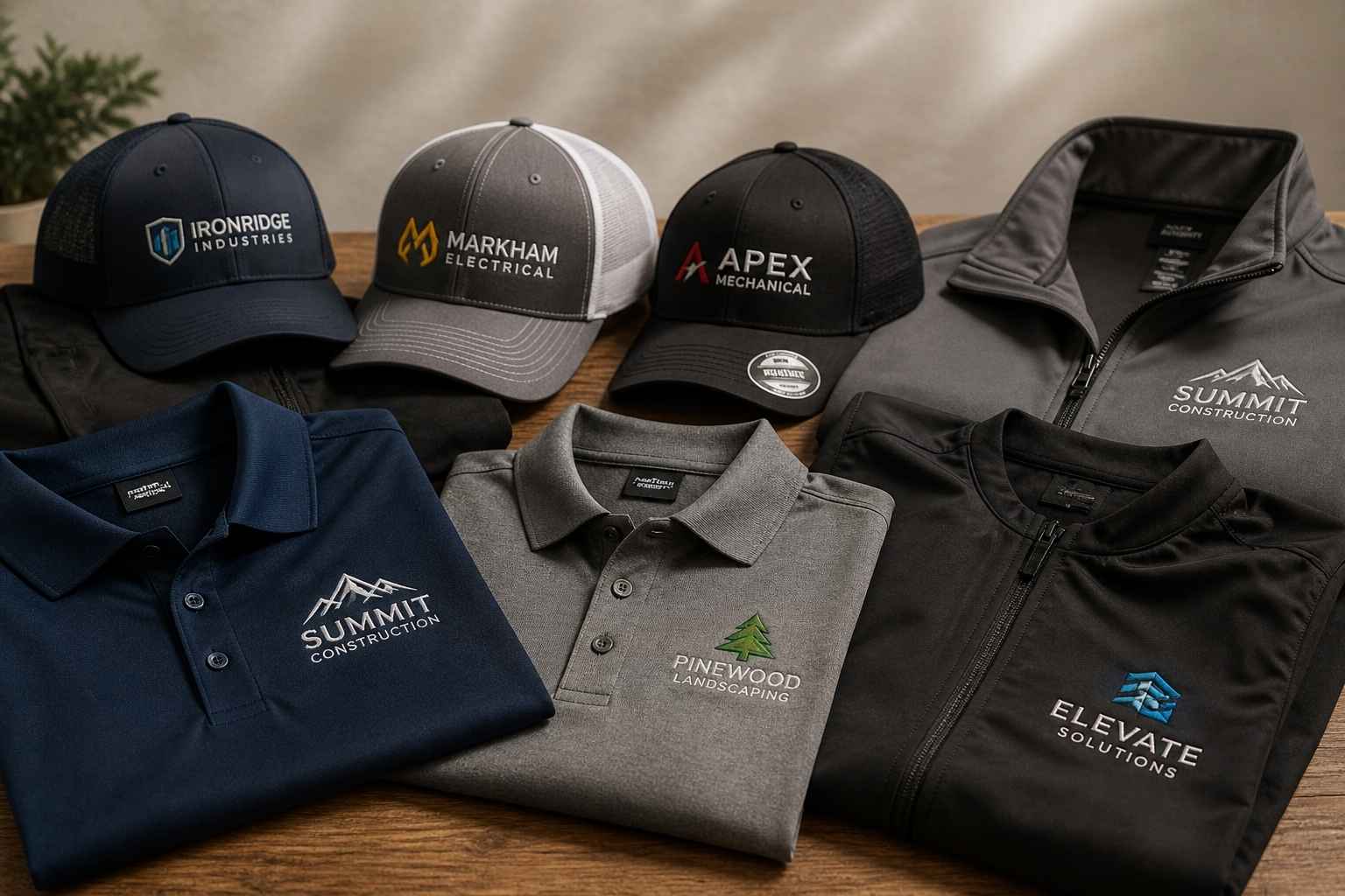
You’ve chosen embroidery. Smart move. A well-stitched logo on a polo shirt or cap carries a weight that screen print simply can’t match — it reads premium, it lasts, and customers notice. But here’s where many businesses lose time and money: sending the wrong file.
Over the years, I’ve seen artwork teams receive everything from WhatsApp screenshots to enormous layered Adobe Illustrator files with 40 unlabelled colours and live text that crashes in every other program.
The result is always the same: delays, rework costs, and a finished product that doesn’t match the brand. This guide gives you exactly what you need to hand your supplier a file that goes straight to production — no back-and-forth, no surprises.
“The single biggest cause of embroidery rejections is customers conflating their brand artwork with a production-ready embroidery file. They are not the same thing.” — Senior digitiser with 18+ years in commercial *embroidery digitising
What Your Embroidery Supplier Actually Needs from You
Artwork files vs. stitch files: why these are not the same thing
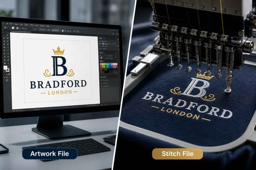
There are two completely different files in the embroidery workflow, and confusing them causes most of the problems clients encounter. An artwork file is your logo as you know it — the PNG, EPS, or AI file you use for websites, business cards, and print. It contains colours, shapes, and sometimes live text. A stitch file (also called a machine file or stitch file) is something else entirely. It is a machine-readable instruction set that tells an embroidery machine where to place each needle penetration, in what order, at what density, and with which thread. It cannot be created by simply exporting your logo in a new format — it requires embroidery digitising, a skilled manual or semi-manual process.
The two-stage workflow every customer should understand
Stage 1 — Artwork submission: You send your best quality logo file to your supplier. Vector is ideal; high-resolution raster works too. The digitiser uses this as a blueprint. Stage 2 — Digitising and production: Your supplier’s digitiser converts that artwork into a stitch file (such as DST or PES) using specialist software like Wilcom, Hatch Embroidery, or Embird. That file is loaded to the embroidery machine — whether a Tajima, Brother, Janome, or Husqvarna Viking — and production begins. Your job is to make Stage 1 as clean as possible. The rest is handled by professionals.
Best File Formats for Logo Embroidery (Ranked)
Vector formats: AI, EPS, SVG (recommended)
Vector artwork is built from mathematical paths rather than pixels. This means it remains perfectly sharp at any size — whether it’s a 10mm chest badge or a 300mm back logo. That scalable file quality is exactly what a digitiser needs to trace your design accurately and set the correct stitch density without guessing. The best vector formats to send:
- AI (Adobe Illustrator) — Industry standard. Preserves layers, colours, and paths with full fidelity.
- EPS — Universally compatible across design and digitising software. Preferred for older workflows.
- SVG — Web-native vector format, increasingly accepted by modern digitising tools. Confirm acceptance with your supplier.
Raster formats: PNG vs JPG — which wins and why
When a vector isn’t available, a raster image at sufficient resolution will do the job. But not all raster formats are equal. PNG wins every time. It supports a transparent background, uses lossless compression, and preserves clean, hard edges — exactly what a digitiser needs to identify your design boundaries accurately. JPG is the worst option for embroidery artwork. JPEG compression introduces artefacts that blur edges and muddy colours. Worse, every JPG has a background — usually white — which forces the digitiser to manually identify what’s actually part of your logo. This slows the process and introduces errors. Avoid it wherever possible.
Machine stitch files: DST, PES, JEF, VP3, EXP explained
Once your artwork is digitised, it’s saved as a stitch file in a format specific to the embroidery machine being used. These formats include:
- DST (Tajima) — The most widely used commercial stitch file format. Compatible with almost all industrial machines, including Tajima systems. Note: DST does not store thread colour information separately — colours are managed via a separate colour sheet.
- PES (Brother) — Preferred for Brother and Baby Lock machines. Stores colour information and design previews within the file.
- JEF (Janome) — Native format for Janome machines.
- VP3 (Viking) — Used by Husqvarna Viking and Pfaff machines. Quality does not come from the format — it comes from the digitising decisions. The format simply determines compatibility.
When to send the stitch file vs. when to let the digitiser start fresh
If you’ve had a logo digitised before and hold the stitch file, it’s worth sending it alongside your artwork. However, bear in mind that a stitch file produced for one machine brand may not load cleanly on another. If you’re switching suppliers or machine types, ask the new team to assess the file before assuming it’s usable. In many cases — particularly when original artwork is clean vector — digitisers prefer to start from scratch. A fresh digitisation allows them to optimise stitch count, underlay stitches, and pull compensation for your specific garment and placement.
Resolution Requirements for Embroidery Logo Files
Why 300 DPI is the floor, not the goal
300 DPI (dots per inch) is the minimum acceptable resolution for embroidery artwork. It ensures the digitiser can zoom into your design and see clean, distinct edges — not a blurry approximation of your logo. For complex logos with fine detail, thin lines, or small text, 600 DPI or higher gives the digitiser more to work with and often produces a sharper result.
What happens when you upscale a low-res logo
If you take a 72 DPI web image and scale it up in Photoshop, you don’t gain detail — you gain larger pixels. The result is a soft, jagged image that a digitiser has to interpret rather than trace. This leads to:
- Approximate outlines that don’t match your original logo
- Uneven edges in the final embroidered result
- Potential back-and-forth approval rounds before production can begin Always go back to the original source file. If you genuinely have no high-resolution version, a professional redraw service can recreate your logo as clean vector artwork from even a low-quality reference.
Does resolution matter if I’m sending a vector file?
No. Resolution is a property of raster (pixel-based) files only. A vector file has no fixed resolution — it is infinitely scalable because it’s built from paths, not pixels. If you’re sending an AI, EPS, or SVG file, resolution is simply not relevant.
How to Simplify Your Logo Before Sending It for Digitising
Minimum text height and line thickness rules
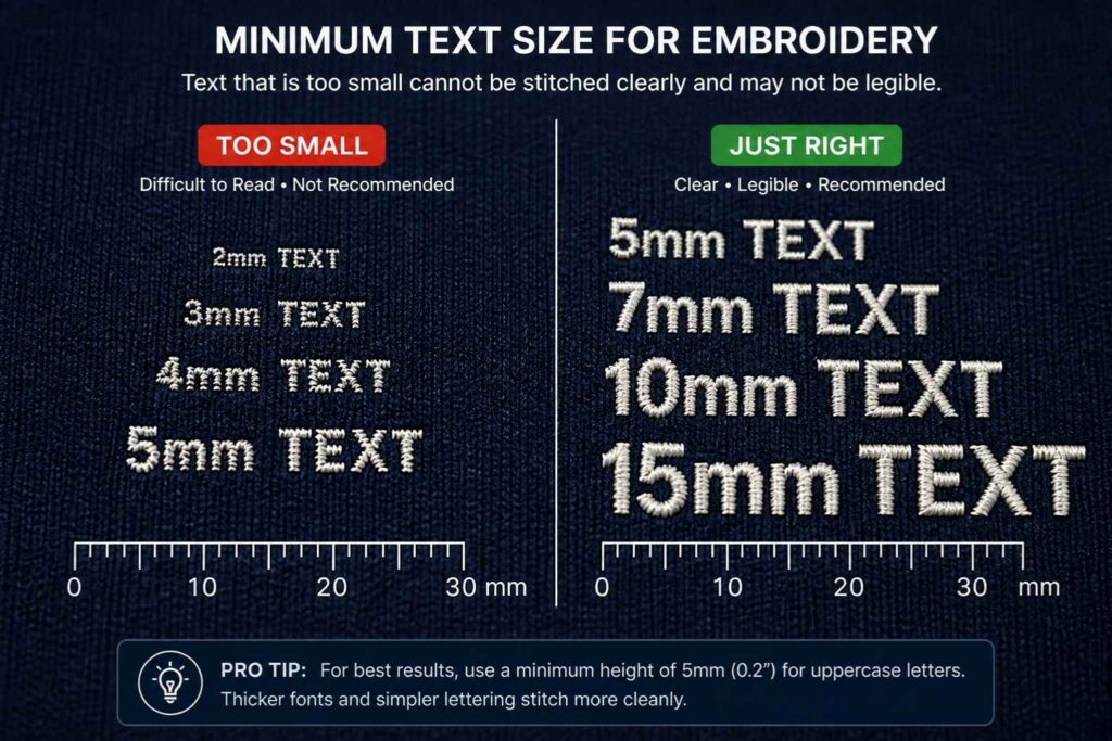
Embroidery has physical constraints that design software does not. A needle and thread cannot reproduce certain levels of fine detail. Adhere to these minimums:
- Text height: Minimum 4mm (approximately 0.25 inches). Below this, letters merge and become unreadable.
- Line thickness: Minimum 1–1.5mm. Lines thinner than this cannot support a satin stitch and typically reduce to a single running stitch, which looks weak and unintentional.
- Negative space: Gaps between design elements should be at least 1mm wide, or thread buildup will obscure them.
Dealing with gradients, shadows, and photographic elements
Thread cannot fade. There is no gradient in embroidery — only solid colour stops and fill stitch patterns that simulate depth. Before sending your file:
- Replace gradients with the nearest solid flat colour
- Remove drop shadows and glows entirely — they don’t translate
- Avoid photographic or highly detailed illustrative elements; these require either heavy simplification or specialist techniques
- Puff embroidery (or 3D embroidery) can add dimension to bold elements like block letters on caps, but it’s a specific production choice — not a way to replicate visual depth from a flat image
How to handle thin serifs, fine details, and small negative space
Serif fonts with thin strokes — particularly at small sizes — frequently cause problems. The hairline elements that give a serif its character are simply too narrow for a needle to render cleanly. Switching to a bold, clean serif or a sans-serif alternative for embroidery versions of your logo is a common and pragmatic solution. Small details — tiny icons, intricate patterns, fine line borders — should be evaluated for removal or enlargement. The logo simplification required for embroidery does not compromise brand recognition when done well. Think of it as creating a dedicated embroidery version of your logo, not a compromised one.
Maximum thread colour limits and what to do if yours exceed them
Most commercial embroidery machines carry between 6 and 15 thread colours per run. Standard production setups typically cap at 6 to 8 colour changes per design, because each colour stop adds time and increases the risk of misregistration. If your logo uses more colours than this:
- Work with your digitiser to identify which colours can be consolidated without losing brand integrity
- Consider creating a simplified colour version specifically for embroidered branded apparel
- If colour accuracy is non-negotiable, discuss unlimited-colour thread painting techniques — though these carry higher production costs
Colour Preparation: Pantone, Thread Matching, and Brand Accuracy
How to specify Pantone references in your file brief
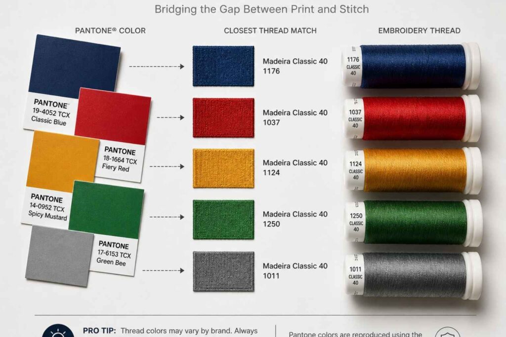
Pantone references are the most reliable starting point for thread colour matching. When submitting your logo file, include a colour brief that lists each colour in your design alongside its Pantone code. Your digitiser will use that reference to identify the closest available thread from their stock. Without Pantone references, the match depends on screen calibration and subjective interpretation — neither of which is reliable for embroidered workwear or custom uniforms where brand consistency matters.
Understanding Madeira, Isacord, and Robison-Anton thread colour systems
The three dominant thread colour systems in professional embroidery are:
- Madeira threads — A European standard with comprehensive colour ranges, widely used across commercial production facilities. Particularly strong on viscose rayon and polyester ranges.
- Isacord — A polyester thread range by Amann Group, known for colourfastness and consistent tension. Widely used for workwear that undergoes regular industrial washing.
- Robison-Anton — An American brand with a broad range of rayon and polyester threads. Popular in North American production facilities. Ask your supplier which system they use and request their thread chart — this allows you to select the closest match to your Pantone reference before production begins.
What to do when your brand colour has no close thread match
It happens. Some brand colours — particularly specific teals, metallics, and neon tones — don’t have a direct thread equivalent. In this situation, you have three options:
- Accept the closest available thread match and adjust your approval expectations accordingly
- Request a sample sew-out on actual fabric before committing to a full production run — this is always recommended for first-time logo digitisations
- Explore metallic or specialist thread options, though these carry limitations around tension and durability
Pro tip: Always order a sample sew-out before bulk production. Seeing your digitised design on the actual garment fabric under real conditions is the only reliable quality check. Even experienced digitisers run tests — it’s not a sign of uncertainty, it’s professional practice.
Sizing Your Logo for Different Embroidery Placements
Left chest vs large back vs cap front — size guidelines per placement
Placement determines everything: the size you digitise for, the stitch count budget, and whether certain details are even viable. Standard size guidelines by placement:
- Left chest placement — Typically 80–100mm wide. The most common placement for corporate custom uniforms and embroidered workwear. At this size, any text must clear the 4mm minimum height rule.
- Cap embroidery (front panel) — Typically 60–80mm wide, with a height restriction of approximately 50–55mm due to the peak. Designs for cap fronts must be simplified accordingly. Puff embroidery is popular here for bold lettering.
- Large back — Can extend to 280–300mm wide. More design detail is viable, but stitch count increases proportionally with size.
- Sleeve — Typically 60–80mm wide, often used for secondary logos or accreditation marks.
How stitch count changes with size (and why it affects cost)
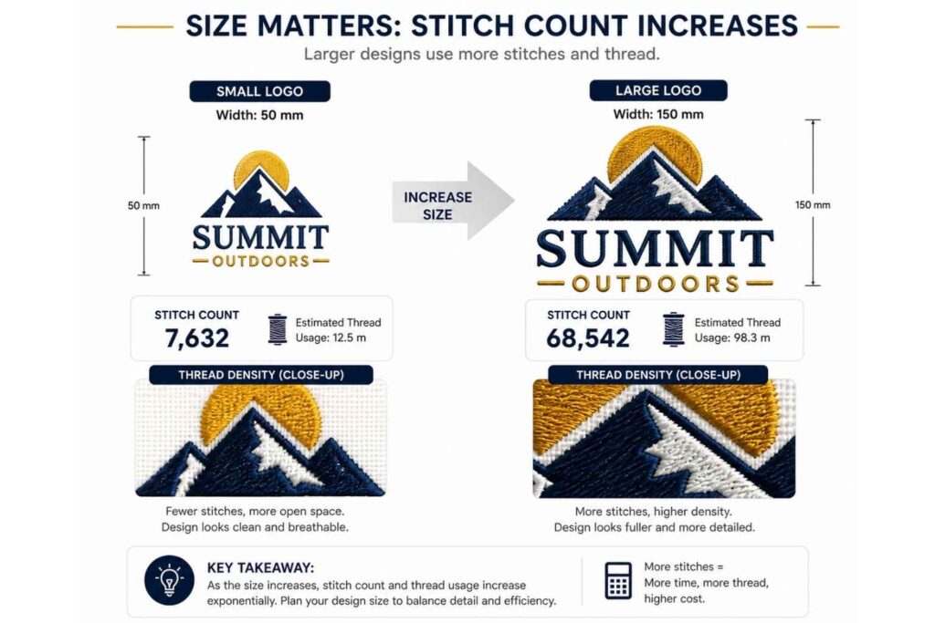
Stitch count is the total number of needle penetrations required to complete your embroidered design. It directly affects:
- Production time — higher stitch counts take longer to run
- Machine wear — dense designs put more load on the machine
- Cost — most suppliers price embroidery partly on stitch count A simple left-chest logo might run at 4,000–8,000 stitches. A large, detailed back design can exceed 50,000 stitches. When you’re ordering branded apparel at volume, understanding this relationship helps you budget accurately. Logo simplification — removing decorative elements, reducing colours, tightening spacing — is one of the most effective ways to control stitch count without compromising recognition.
Common Logo Prep Mistakes That Cause Delays and Rejections
Sending a screenshot or low-res JPEG
A screenshot taken on a phone or from a website is typically 72–96 DPI. Scaled to embroidery dimensions, it produces a blurry reference that no digitiser can accurately trace. The result: delays while your supplier chases a better file, or a digitised logo that only approximates your original. If you genuinely don’t have the original artwork file, contact your designer, brand agency, or the person who created your logo. That original file almost certainly exists somewhere.
Fonts not converted to outlines
Live text in a design file is only visible on systems that have that font installed. When a supplier opens your AI or EPS file and the font isn’t installed, it either substitutes a different typeface or displays an error. The fix is simple: in Adobe Illustrator, select all text and use Type > Create Outlines (Shift+Ctrl/Cmd+O) to convert to outlines before saving. This locks the letterforms as vector paths — no font dependency, no substitution risk.
Always keep a copy of your original editable file before converting text to outlines. Once outlines are applied, the text cannot be edited as live type.
Logos with a white background instead of transparent
A logo saved on a white background presents a specific problem: the digitiser cannot immediately tell what is logo and what is background. For a design placed on a dark garment, a white fill will be stitched unless it’s explicitly removed from the brief. Always save logo files with a transparent background where possible (PNG format supports this; JPG does not). If you’re unsure, open the file in any image viewer and confirm that the background shows a chequerboard pattern — the universal indicator of transparency.
Assuming a good print file will also be a good embroidery file
This is the most common mistake, and it’s understandable. A well-prepared print file — high resolution, correct colour profile, clean composition — looks like it should work for anything. It doesn’t. Print and embroidery are fundamentally different production processes. A print file optimised for CMYK output may contain:
- Gradients and colour blends that cannot be reproduced in thread
- Colours specified in RGB or CMYK with no Pantone equivalent provided
- Fine detail that printed at 300 DPI but cannot be stitched at any scale
- Live text that needs converting to outlines before the digitiser can work with it Treat your embroidery file brief as a separate deliverable, not a repurposed print pack.
People Also Ask
Can I use a PDF for embroidery?
What if I don't have a vector version of my logo?
How long does digitising take?
Will my logo look the same on different fabrics?
Do I own my digitised embroidery file?
Final Thoughts
Preparing your logo correctly for embroidery is not complicated — but it does require understanding that the process is different from print. The core principles are straightforward:
- Send vector artwork wherever possible (AI, EPS, or SVG)
- If sending raster, use PNG at 300 DPI minimum with a transparent background
- Simplify gradients, fine detail, and thin text before sending
- Provide Pantone references for brand-accurate thread colour matching
- Always request a sample sew-out for any new design
- Clarify ownership of the stitch file before commissioning digitising Get these fundamentals right, and the embroidery process becomes remarkably smooth. Your supplier spends less time troubleshooting, your digitiser produces a sharper result, and your finished custom uniforms and embroidered workwear arrive looking exactly as your brand deserves.